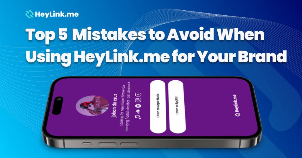
Top 5 Mistakes to Avoid When Using HeyLink.me for Your Brand
HeyLink.me is a fantastic tool for brands looking to optimize their digital presence and engage their audience in a seamless way. However, to truly get the most out of it, there are a few common mistakes that brands tend to make. Let’s walk through the top 5 mistakes to avoid, ensuring your HeyLink.me page works as a powerful extension of your brand.
1. Neglecting Your Page Design.
Your HeyLink.me page is often the first impression your audience gets of your brand, so it needs to look polished and professional. A common mistake is leaving the design too basic or inconsistent with your overall branding. You should take advantage of the customization options by choosing colors, fonts, and layouts that reflect your brand’s identity.
Pro Tip: Use your brand’s logo, consistent color palette, and recognizable design elements to create a cohesive experience.
2. Overloading Your Page with Links.
It’s tempting to add every possible link to your HeyLink.me page, but overloading your page with too many options can confuse your audience. Instead, focus on prioritizing the most important and relevant links. Keep your list concise and guide users toward the most valuable content or products you offer.
Pro Tip: Stick to 5-7 essential links. Too many links can overwhelm visitors, but a focused selection increases the chances they’ll engage with your content.
3. Not Updating Your Links Regularly.
One of the biggest benefits of HeyLink.me is the ability to update your page in real time, yet many users make the mistake of leaving old or irrelevant links. An outdated page can make you look inactive or out of touch with your audience. Make sure to review your links periodically and replace them with current offers, content, or news.
Pro Tip: Set a monthly reminder to check and update your HeyLink.me page. Keep things fresh by promoting new products, services, or content.
4. Ignoring Analytics.
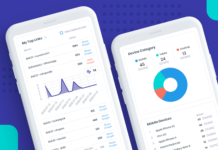
HeyLink.me offers detailed analytics to help you track how your audience interacts with your page, but many users neglect this feature. Failing to review your analytics means missing out on valuable insights into which links are performing well and where improvements are needed. By monitoring this data, you can adjust your strategy and optimize your page for better engagement.
Pro Tip: Use the analytics to A/B test different headlines, calls-to-action, or even the order of your links to see what resonates most with your audience. HeyLink.me gives you insight into every aspect of your audience so you can learn and optimize.
5. Missing a Clear Call to Action (CTA).
Every successful marketing tool needs a clear CTA, and HeyLink.me is no exception. Failing to guide your audience on what to do next can result in missed opportunities. Whether you want them to sign up for a newsletter, purchase a product, or follow your social media, make sure you have a strong, actionable CTA on your page.
Pro Tip: Place your CTA at the top of your page for visibility. Phrases like “Join Now,” “Shop Here,” or “Follow for Updates” can encourage your visitors to take action.
Wrap-Up
HeyLink.me is an incredibly versatile tool, but it’s important to avoid these common mistakes to maximize its effectiveness. By focusing on design, keeping your links relevant, leveraging analytics, and incorporating strong CTAs, you can create a HeyLink.me page that not only represents your brand but actively drives engagement and conversions.
Looking for more tips on how to optimize your HeyLink.me page? Keep checking back on our blog for the latest advice and features!

