Best Design Tips for Creating Stunning HeyLink.me Pages!
Your HeyLink.me page is your digital business card, your online storefront, and your personal brand hub all rolled into one. To make a lasting impression and maximize engagement, it’s crucial to design your page thoughtfully.
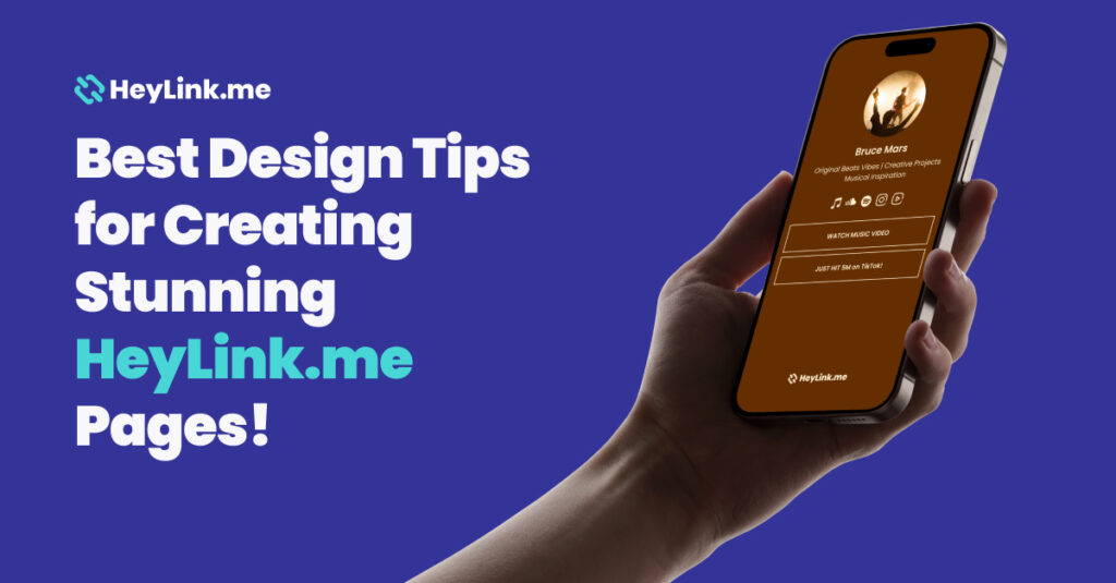
Here are some top tips to help you create a stunning HeyLink.me page that stands out from the crowd:
1. Understand Your Brand and Audience
Before diving into the design, take a moment to reflect on your brand’s identity and the audience you are trying to reach. Ask yourself what kind of vibe or message you want to convey. Are you aiming for a minimalist, professional look, or something more vibrant and playful? Understanding this will guide your color choices, font styles, and overall layout, ensuring that your HeyLink.me page aligns with your brand and appeals to your target audience.
2. Choose a Cohesive Color Scheme
Color is a powerful tool in design that can influence emotions and perceptions. For a stunning HeyLink.me page, choose a color scheme that reflects your brand identity and sticks to it throughout the page. A cohesive color palette makes your page look organized and professional. If you’re unsure which colors to pick, try using a range of stunning HeyLink.me themes (choose form 10 categories).
3. Use High-Quality Images and Icons
Visual elements are key to creating an engaging HeyLink.me page. High-quality images, icons, and graphics not only make your page more attractive but also help communicate your message more effectively. Ensure that all images are clear and optimized for web use to maintain fast loading times. Avoid using pixelated or stretched images, as these can detract from the professionalism of your page.
To ensure that your portrait and landscape images have a good appearance, it is recommended to use a width of at least 1080 pixels. This will help to ensure that the images are large enough to be viewed clearly on most devices and screens. Preview 800×800 px Badge image – The recommended pixel dimensions of 1200:630 px Size up to 6 MB More than 1200 by 1200 does not make sense to download.
So that the gif is not rearranged and resized, it should be no larger than 200*200 pixels for the avatar and 600*600 pixels for the cover.
4. Optimize Your Font Choices
Typography plays a significant role in the readability and aesthetic appeal of your HeyLink.me page. Select fonts that are easy to read and align with your brand’s tone. Be mindful not to use too many different fonts; sticking to one or two complementary fonts will keep your design clean and cohesive.
5. Keep Your Layout Simple and Intuitive
When designing your HeyLink.me page, simplicity is key. A cluttered page can overwhelm visitors and make it difficult for them to find the information they’re looking for. Organize your links and content in a way that’s easy to navigate. Use headers, subheaders, and delimiter to break up sections and guide users through your page. White space is your friend; it helps create a clean, airy feel and prevents your page from looking overcrowded.
6. Incorporate Engaging Call-to-Actions (CTAs)
A great HeyLink.me page doesn’t just look good; it encourages users to take action. Whether you want visitors to check out your latest blog post, subscribe to your newsletter, or follow you on social media, your CTAs should be clear, compelling, and easy to spot. Use contrasting colors for your CTA buttons to make them stand out and ensure the language is direct and action-oriented.
7. Test on Multiple Devices
Today’s users access content from a variety of devices, including smartphones, tablets, and desktop computers. Make sure your HeyLink.me page is responsive and looks great on all screen sizes. Test your page on different devices and browsers to ensure that all elements are displayed correctly and the page is easy to navigate.
8. Update Regularly
A stunning HeyLink.me page isn’t a one-time effort; it requires regular updates to stay fresh and relevant. Keep your content up to date by adding new links, updating your profile picture, and refreshing your design periodically. Regular updates show visitors that your page is active and well-maintained, encouraging them to return.
9. Optimize Your Link Order
The placement of your links matters. Place the most important links at the top of your page where they are easily accessible. This could include your latest content, special promotions, or key social media profiles. Organize your links in a way that guides your audience through your content, making it easy for them to find what they’re looking for.
Designing a stunning HeyLink.me page is about more than just aesthetics; it’s about creating a functional, user-friendly experience that effectively promotes your brand and engages your audience.
By following these design tips, you can craft a HeyLink.me page that not only looks great but also drives results. Keep your design simple, stay true to your brand, and always be open to testing and iterating for the best possible outcome. Happy designing!

